
10 Proven UX Design Principles That Boost Website Conversions

At a Glance
UX design principles for conversions represent the strategic intersection where user psychology meets business objectives, creating digital experiences that naturally guide visitors toward desired actions. These evidence-based methodologies can increase conversion rates by up to 400% when properly implemented, transforming underperforming websites into revenue-generating assets that consistently deliver measurable results for businesses struggling with low conversion rates.

Table of Contents
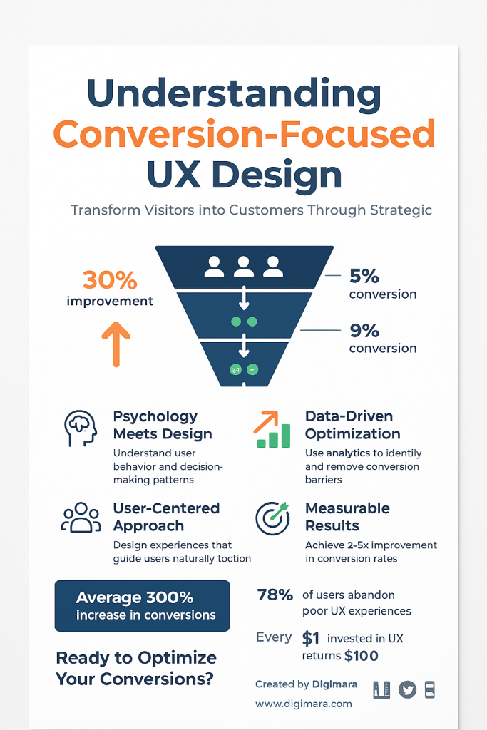
Understanding Conversion-Focused UX Design
Conversion-focused UX design transcends aesthetic appeal, prioritizing psychological principles and behavioral patterns that influence user decision-making. At Digimara Technology, we’ve witnessed countless Rockwall businesses transform their digital presence by implementing these UX design principles for conversions, often seeing dramatic improvements within weeks of implementation.
The fundamental difference between traditional web design and conversion-optimized UX lies in intentional user journey orchestration. Every element serves a specific purpose in guiding users toward conversion actions, whether purchasing products, scheduling consultations, or subscribing to services.
Modern consumers expect seamless, intuitive experiences that anticipate their needs while minimizing cognitive burden. Research consistently demonstrates that users form first impressions within 50 milliseconds, making initial visual impact crucial for conversion success. However, sustained engagement depends on deeper UX design principles for conversions that address user psychology, reduce friction, and build confidence throughout the decision-making process.
Effective conversion optimization requires understanding user motivations, pain points, and behavioral triggers. This knowledge informs design decisions that feel natural and helpful rather than manipulative or pushy. The most successful implementations blend persuasive design techniques with genuine user value, creating win-win scenarios where business objectives align with user satisfaction.
Principle 1: Cognitive Load Reduction
Cognitive load reduction represents the foundation of conversion-optimized user experiences. When users encounter overwhelming information density, complex navigation structures, or confusing interface elements, their mental processing capacity becomes overloaded, leading to decision paralysis and abandonment.
Successful implementation begins with ruthless content prioritization. Every page element should serve a clear purpose in advancing users toward conversion goals. Remove unnecessary distractions, simplify language, and present information in digestible chunks that support rather than hinder decision-making processes.

Visual clutter elimination proves equally important. White space isn’t empty space it’s strategic breathing room that allows important elements to command attention. Proper spacing between sections, consistent typography hierarchy, and logical information grouping create mental clarity that facilitates user comprehension and action.
Navigation simplification directly impacts conversion rates. Complex menu structures, buried important pages, and unclear pathways frustrate users and increase bounce rates. Implement intuitive navigation patterns, clear labeling, and logical information architecture that guides users effortlessly toward conversion opportunities.
Consider progressive disclosure techniques that reveal information gradually based on user engagement levels. This approach prevents overwhelming initial visitors while providing detailed information for users ready to dig deeper. Accordion menus, expandable sections, and step-by-step processes exemplify effective progressive disclosure implementation.
Principle 2: Visual Hierarchy Optimization
Visual hierarchy optimization directs user attention through strategic design choices that create clear information prioritization. Effective hierarchy guides eyes naturally through content, emphasizing conversion-critical elements while maintaining overall design cohesion and aesthetic appeal.
Size, color, contrast, and positioning work together to establish hierarchy levels. Primary calls-to-action should dominate visual attention through bold colors, larger sizes, and prominent placement. Secondary elements receive moderate emphasis, while supporting content maintains subtler visual treatment that doesn’t compete for attention.
Typography hierarchy extends beyond simple size variations. Font weights, spacing, color contrast, and formatting choices communicate information importance and relationship. Consistent heading structures, readable body text, and strategic emphasis techniques create scannable content that users can quickly comprehend and act upon.
Color psychology plays a significant role in hierarchy optimization. Warm colors like red and orange naturally draw attention and create urgency, making them effective for call-to-action elements. Cool colors like blue and green convey trust and stability, suitable for informational content and supporting elements.
Directional cues subtly guide user attention toward conversion elements. Arrow shapes, line directions, whitespace patterns, and even human gaze direction in photographs can influence where users look and how they navigate through content. These subtle influences compound to create powerful conversion optimization effects.
Principle 3: Strategic Call-to-Action Placement
Strategic call-to-action placement transforms passive visitors into active participants through carefully orchestrated engagement opportunities. Effective CTA placement considers user journey stages, page flow patterns, and psychological readiness for conversion commitment.
Above-the-fold placement captures immediate attention from motivated visitors ready to take action quickly. However, this primary CTA should be supported by additional conversion opportunities throughout the page that catch users at different engagement levels and decision-making stages.
The “inverted pyramid” approach places the strongest CTA first, followed by progressively softer conversion opportunities. This strategy accommodates varying user readiness levels while maximizing conversion potential across different visitor segments and engagement depths.
Button design significantly impacts CTA effectiveness. Size, color, shape, and surrounding whitespace influence click-through rates. Action-oriented language like “Get Started,” “Claim Your Spot,” or “Transform Your Business” proves more compelling than generic phrases like “Submit” or “Click Here.”
Multiple CTA variations throughout lengthy content maintain conversion opportunities without appearing overly aggressive. Vary the language, design, and positioning while maintaining consistent brand messaging and value propositions. This approach captures users at their optimal decision-making moments.
Principle 4: Trust Signal Integration
Trust signal integration addresses the fundamental barrier preventing many website conversions: credibility concerns. Users hesitate to provide personal information, make purchases, or commit to services without sufficient confidence in business legitimacy and competence.
Security indicators provide foundational trust building. SSL certificates, secure payment badges, privacy policy links, and industry certifications demonstrate commitment to user protection and professional standards. Display these prominently without cluttering the interface design.
Social proof elements leverage human psychology’s tendency to follow others’ behaviors. Customer testimonials, case studies, client logos, user counts, and review scores provide evidence of business value and reliability. Authentic, specific testimonials outperform generic praise in building genuine user confidence.
Contact information transparency builds credibility through accessibility. Physical addresses, phone numbers, team member photographs, and about page details humanize businesses and demonstrate legitimate operations. This information particularly matters for local Rockwall businesses serving regional markets.
Professional design quality itself functions as a trust signal. Clean layouts, error-free content, consistent branding, and polished visual presentation suggest attention to detail and business competence. Users often judge service quality based on website presentation standards.
Principle 5: Mobile-First Responsive Design
Mobile-first responsive design acknowledges the reality that most users access websites through mobile devices, requiring optimization that prioritizes smaller screen experiences while maintaining desktop functionality and appeal.
Touch-friendly interface elements accommodate finger navigation rather than mouse precision. Buttons, links, and interactive elements need sufficient size and spacing to prevent accidental taps. Minimum 44-pixel touch targets ensure accessibility across different device sizes and user capabilities.
Loading speed optimization becomes critical on mobile devices with varying connection speeds. Image compression, code minification, caching strategies, and content delivery networks reduce loading times that directly impact conversion rates. Every second of delay can decrease conversions by significant percentages.
Simplified navigation accommodates limited mobile screen real estate. Hamburger menus, collapsible sections, and streamlined content hierarchies maintain functionality while preserving screen space for conversion-critical elements and content.
Form optimization for mobile input reduces friction in conversion processes. Auto-complete functionality, appropriate input types, and minimal required fields decrease user effort and increase completion rates. Consider breaking lengthy forms into multiple steps to reduce abandonment.
Principle 6: Progressive Information Disclosure
Progressive information disclosure manages information complexity by revealing details incrementally based on user engagement and interest levels. This approach prevents overwhelming initial visitors while providing comprehensive information for users ready to dive deeper.
Accordion menus and expandable sections allow users to access detailed information without cluttering initial page views. This technique works particularly well for FAQ sections, product specifications, and service details that some users need while others prefer simplified overviews.
Tabbed content organization separates different information categories while maintaining single-page convenience. Users can focus on relevant sections without scrolling through unrelated content, improving engagement and reducing cognitive load throughout the decision-making process.
Tooltips and hover states provide additional context without permanent screen space commitment. These micro-interactions offer helpful explanations, definitions, or supplementary details that enhance user understanding without cluttering the primary interface design.
Multi-step processes break complex actions into manageable segments. Rather than presenting overwhelming single-page forms or complicated decision trees, guide users through logical progressions that feel achievable and maintain momentum toward conversion completion.
Principle 7: Social Proof Implementation
Social proof implementation leverages psychological tendencies to follow others’ behaviors, particularly in uncertain situations. Effective social proof creates confidence and reduces perceived risk associated with conversion actions.
Customer testimonials provide authentic experiences that potential customers can relate to and trust. Video testimonials often prove more compelling than text alone, as they demonstrate real people sharing genuine experiences. Focus on specific results and outcomes rather than generic praise.
Usage statistics and user counts demonstrate popularity and widespread adoption. Numbers like “Join 10,000+ satisfied customers” or “Over 500 businesses served in Rockwall” suggest successful track records and community acceptance.
Client logos and case studies showcase business credibility through association with recognized brands or successful outcomes. Industry awards, certifications, and media mentions further establish authority and expertise in relevant fields.
Real-time activity indicators like “23 people viewing this page” or “5 customers purchased in the last hour” create urgency while demonstrating ongoing demand. Use these carefully to avoid appearing manipulative or generating skepticism about authenticity.
Principle 8: Friction Point Elimination
Friction point elimination identifies and removes obstacles that prevent users from completing desired actions. Every additional step, required field, or confusing element increases abandonment likelihood and reduces overall conversion rates.
Form optimization reduces completion barriers through field minimization, smart defaults, and logical grouping. Only request essential information during initial conversions, gathering additional details through follow-up processes or progressive profiling techniques.
Error prevention and clear recovery paths maintain user momentum when issues occur. Inline validation, helpful error messages, and obvious correction methods prevent frustration and abandonment during critical conversion moments.
Payment process simplification accommodates various user preferences and technical capabilities. Multiple payment options, guest checkout alternatives, and saved payment methods reduce barriers that commonly cause shopping cart abandonment.
Loading time optimization addresses technical friction that damages user experience. Slow pages create negative impressions and increase bounce rates, particularly on mobile devices with limited processing power or connection speeds.
Principle 9: Psychological Triggers
Psychological triggers tap into fundamental human motivations and decision-making patterns. Understanding and ethically applying these principles creates persuasive user experiences that feel natural rather than manipulative.
Scarcity and urgency motivate action through fear of missing out. Limited-time offers, inventory counts, and deadline messaging encourage prompt decision-making. Use these techniques authentically false scarcity damages trust and long-term relationships.
Reciprocity principles suggest that people feel obligated to return favors or gifts. Free resources, valuable content, or trial offers create positive feelings that increase willingness to reciprocate through conversions or purchases.
Authority positioning establishes expertise and credibility through credentials, awards, publications, or industry recognition. Users prefer working with recognized experts and established authorities in relevant fields.
Loss aversion psychology suggests people fear losing benefits more than they value equivalent gains. Frame value propositions around preventing losses or missing opportunities rather than simply highlighting potential benefits.
Principle 10: Data-Driven Personalization
Data-driven personalization creates tailored experiences that speak directly to individual user needs, preferences, and behaviors. Modern users expect relevant, customized interactions rather than generic, one-size-fits-all approaches.
Behavioral tracking informs personalization decisions through user journey analysis, page engagement patterns, and conversion path identification. This data reveals user preferences and pain points that inform targeted optimization efforts.
Geographic personalization acknowledges location-specific needs and preferences. Local businesses can reference regional landmarks, weather conditions, or community events that resonate with target audiences and build connection.
Demographic segmentation allows message customization for different user groups. Age, profession, company size, or industry-specific needs inform content presentation, language choices, and value proposition emphasis.
Previous interaction history enables progressive relationship building through acknowledgment of past engagement, customized recommendations, and streamlined repeat interactions that reduce friction for returning users.
Implementation Strategy for Rockwall Businesses
Rockwall businesses implementing UX design principles for conversions should begin with comprehensive current state assessment. Analyze existing website performance, user behavior patterns, and conversion funnel effectiveness to identify high-impact improvement opportunities.
Priority implementation focuses on principles with highest conversion impact potential. Start with cognitive load reduction and visual hierarchy optimization, as these foundational elements enable other principles to function more effectively.
Local market considerations influence implementation approaches. Rockwall’s growing business community, proximity to Dallas markets, and diverse industry presence create unique opportunities for targeted optimization strategies.
Testing and iteration ensure optimization efforts produce measurable results. A/B testing, user feedback collection, and performance monitoring guide continuous improvement processes that compound conversion gains over time.
Professional implementation through experienced partners like Digimara Technology accelerates results while avoiding common pitfalls. Expert guidance ensures proper principle application and integration across complex digital ecosystems.
Measuring Success and ROI
Conversion rate tracking provides primary success metrics for UX optimization efforts. Monitor improvements across different user segments, traffic sources, and device types to understand optimization impact comprehensively.
Revenue attribution connects UX improvements to business outcomes. Track not just conversion quantity but also conversion quality, customer lifetime value, and revenue per visitor improvement
User experience metrics complement conversion data through engagement measurement, satisfaction scores, and usability assessments. These qualitative measures predict long-term success and customer relationship quality.
Cost per acquisition improvements demonstrate optimization efficiency. Effective UX design reduces marketing costs by converting higher percentages of existing traffic rather than requiring additional visitor acquisition.
Long-term performance monitoring ensures sustained optimization benefits. Regular assessment, competitive analysis, and emerging technology integration maintain conversion advantages as markets evolve and user expectations change.
Conclusion: Transform Your Digital Presence Today
These 10 proven UX design principles for conversions represent your roadmap to dramatically improved website performance and business growth. At Digimara Technology, we’ve helped countless Rockwall businesses implement these strategies, consistently delivering conversion rate improvements that transform struggling websites into powerful revenue generators.
Don’t let poor user experience continue costing you customers and revenue. Every day you delay optimization represents lost opportunities and competitive disadvantage in today’s digital marketplace.
Ready to revolutionize your website’s conversion performance? Contact Digimara Technology today for a comprehensive UX audit and personalized optimization strategy. Our expert team will analyze your current performance, identify high-impact improvement opportunities, and create a customized implementation plan that delivers measurable results within weeks.
Call 940-331-0036 or visit our website at https://digimara.net to schedule your free consultation.Together, we’ll transform your website from a digital business card into a conversion-optimized powerhouse that consistently delivers the results your business deserves.
About Digimara Technology: Leading digital marketing agency serving Rockwall, Texas, and surrounding communities. Specializing in conversion-focused UX design, comprehensive digital strategies, and measurable business growth solutions for companies ready to dominate their markets.